I just read an interesting article about the type foundry Hoefler & Frere-Jones. I love reading about people who spend their day deciding that the flourish of the M is too big and just which 13th century material would be the best reference (really! I'm not kidding!). The article talks about a project that the firm did for the Nature Conservancy. Hoefler & Frere-Jones ended up creating a font for them called Oakleaf, which is modified version of their font Requiem.
 I tried to find a piece from the Nature Conservancy where they actually used this font, but to no avail. With all those amazing swashes, I'm sure the piece was beautiful!
Always wanted to show the world that awesome "F" you drew in the margin of your notebook? Letter Playground displays user submitted designs using the letters of the alphabet. Anyone can send in their work. The site says that artwork is copyrighted, so I can't display it for you here, but go check it out! Let us know if you submit anything!
Continuing here on the trend of type-nerdiness, I saw these whimsical screen-printed tea towels by Linzie Hunter. My mom has a tea towel hanging from a dowel in the kitchen (next to this poster) and I think Linzie's work would be great to hang as well.
 Linzie has an etsy shop and sadly this towel isn't available but she has lots of other fun prints to check out!
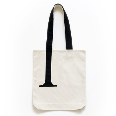
I saw the most amazing type-geek bag at Veer today.

So subtle, so great.
I am not going to even give you any tantalizing peeks. This stuff must be seen on the original site, so you can keep clicking the "previous" button to make you sure you see every single thing they post. Typography that could be in your school textbook under the "awesome" catagory.Go. Now!

 See more amazing designs from designer Debi Zeinert at her gallery at Bella Figura.


 Linzie has an etsy shop and sadly this towel isn't available but she has lots of other fun prints to check out!