If you have ever spent time in New York City, you have surely spent at least a few minutes squinting over the subway map, trying to decide if you actually on the uptown or downtown train and where you could get a free transfer back. The New York Times reports that for the first time in more than a decade, the MTA is freshening up the map's graphics. They are changing colors to improve contrast and adding a shadow to route lines. nytimes.com has a nice graphic comparing the new and old maps:

(click through to the article see a better version, where you can focus on specific boros and change to comapre older versions of the map as well)It should be interesting to see it in action coming next month.
Always wanted to show the world that awesome "F" you drew in the margin of your notebook? Letter Playground displays user submitted designs using the letters of the alphabet. Anyone can send in their work. The site says that artwork is copyrighted, so I can't display it for you here, but go check it out! Let us know if you submit anything!
I saw these salt and pepper shakers from Antrepo Design and I couldn't help but giggle and then shake my head in admiration. Who thinks of things like this?


Continuing here on the trend of type-nerdiness, I saw these whimsical screen-printed tea towels by Linzie Hunter. My mom has a tea towel hanging from a dowel in the kitchen (next to this poster) and I think Linzie's work would be great to hang as well.
 Linzie has an etsy shop and sadly this towel isn't available but she has lots of other fun prints to check out!
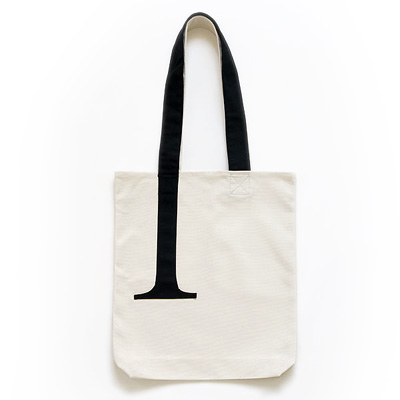
I saw the most amazing type-geek bag at Veer today.

So subtle, so great.


 Linzie has an etsy shop and sadly this towel isn't available but she has lots of other fun prints to check out!


 I'm not sure I could get away with some of these, but I love the idea!